AI Cabinet Color Visualizer: Test Kitchen & Bath Colors Before You Paint (2026 Guide)
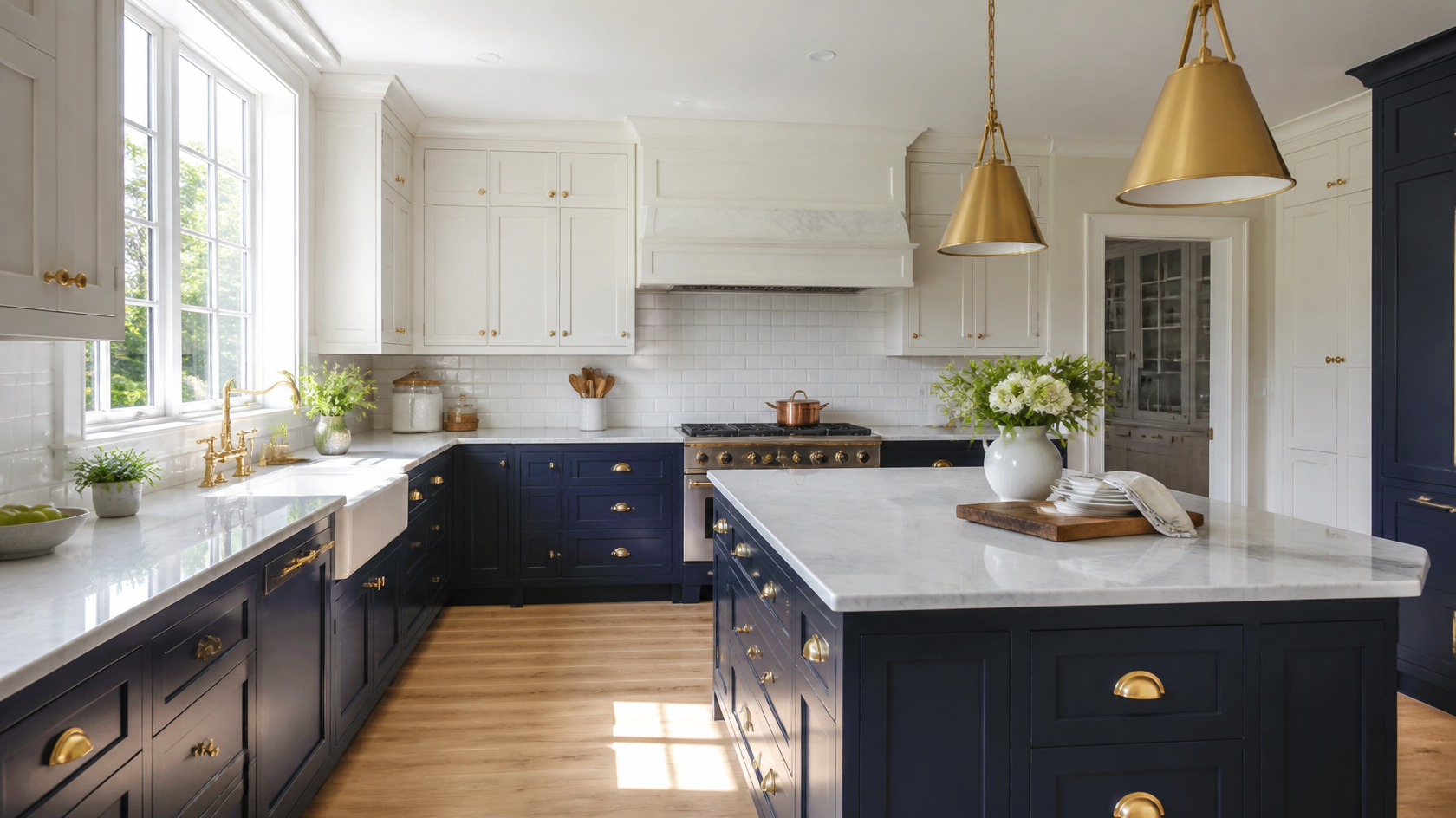
Changing your cabinet color is the highest-leverage move in any kitchen or bathroom refresh. Walk into a 1990s-builder kitchen, repaint the cabinets, and you have a different room. Same boxes, same hardware holes, same square footage — but a completely different feel. The problem? A full repaint runs $1,200 to $7,000 depending on cabinet count and prep work, plus 3 to 6 days of disruption. Get the undertone wrong and you live with it for the next decade.
That's why cabinet color visualizers exist — and why AI-driven tools like GenRoom have replaced fan-deck guesswork with photorealistic previews of your actual cabinets in dozens of colors, finishes, and lighting conditions in under a minute. Upload one photo, swap colors, compare side-by-side, narrow to three samples before you ever pick up a brush. This guide covers exactly how to do it: the colors trending in 2026, paint codes worth ordering, undertone rules nobody warns you about, and the differences between kitchen and bath cabinet decisions.
What Is an AI Cabinet Color Visualizer?
An AI cabinet color visualizer is a tool that takes a photo of your existing kitchen or bathroom, detects the cabinet surfaces automatically, and re-renders them in any color you specify — preserving the original lighting, shadows, hardware, countertops, and surrounding finishes. Unlike paint-brand visualizers from 2015 that swapped flat color chips into a stock illustration, modern AI tools work on your real photo and produce a result indistinguishable from a professional renovation render.
Three things make AI cabinet visualizers different from older tools:
- Photo-based, not template-based. You upload your actual kitchen — the one with the awkward soffit, the off-center range, the window above the sink. The AI works with what you have.
- Realistic lighting transfer. When you paint a cabinet sage green, the AI doesn't just bucket-fill — it accounts for the warm morning light through your east-facing window, the LED under-cabinet lighting, and the bounce from your countertop.
- Hardware and detail preservation. Brass cup pulls stay brass. Glass uppers stay glass. Crown molding keeps its profile. You're previewing a paint job, not a redesign.
The result is a side-by-side comparison that lets you reject a color in 30 seconds instead of buying a $12 sample pot, prepping a door, painting two coats, waiting 24 hours, and squinting at it in different lighting before deciding it's wrong.
Why Cabinet Color Matters More Than You Think
The Houzz 2026 Kitchen Trends Report quantifies what designers have been saying for years: cabinets are the largest continuous surface in most kitchens, accounting for roughly 30 to 40 percent of the visible volume. Change them and you change the room's temperature, perceived size, and emotional tone.
The same report shows the shift away from all-white in real numbers. Wood-finish cabinets now lead at 29 percent of kitchen renovations (up six points year-over-year), with white sliding to second place at 28 percent (down five points). Off-white holds 15 percent. Green has overtaken gray at 6 versus 5 percent, and the long tail — blue, beige, black, greige — each sits below 5 percent but is growing.
For bathrooms, the trend is even more pronounced. Designers report that bathroom vanity colors have shifted from "default white" to deliberate, mood-setting choices: deep navy, forest green, warm terracotta, and natural wood are all gaining ground because bathrooms function as private retreats where personality is welcomed rather than resold.
The financial argument is simple. National Kitchen and Bath Association (NKBA) member surveys consistently show cabinet refinishing returns 60 to 70 percent at resale versus 20 to 40 percent for cabinet replacement — but only when the color choice is right. A trendy color that ages poorly or clashes with permanent finishes drops resale closer to zero. Color choice is where the AI visualizer earns its keep.
Top 2026 Cabinet Colors With Paint Codes
These are the colors actually being specified by working designers in 2026, with the exact codes you can ask for at any Sherwin-Williams, Benjamin Moore, or Farrow & Ball store. We've split them by mood so you can match the right family to your room's lighting and your tolerance for color commitment.
Greens: The Defining Color of 2026

Green replaced navy as the most-specified non-neutral cabinet color in 2026. The reason is not fashion — it's flexibility. Soft, gray-leaning greens read as a calm neutral in north light, a true green in south light, and never feel as committed as a deep blue or black.
| Color | Code | Brand | Best For |
|---|---|---|---|
| Evergreen Fog | SW 9130 | Sherwin-Williams | Universal cabinet color, reads gray-green |
| Backwater | SW 6307 | Sherwin-Williams | Slightly deeper, more sage |
| Card Room Green | No. 79 | Farrow & Ball | English-country sage with depth |
| Calke Green | No. 34 | Farrow & Ball | Earthy, almost olive |
| Saybrook Sage | HC-114 | Benjamin Moore | Restoration palette, warm-leaning |
| Hidden Gem | N430-5 | Behr | Budget alternative, deeper jewel tone |
Pair with: light oak or rift-sawn white oak flooring, creamy off-white walls (Benjamin Moore White Dove OC-17 or SW Alabaster SW 7008), unlacquered or polished brass hardware, soft quartz with warm veining.
Avoid: cool gray walls (will fight the green's warm undertone), chrome hardware (reads too clinical against organic green), bright white quartz with stark gray veining.
Blues: Still Strong, Now Smarter
Navy was the cabinet color of 2018 through 2023, and it hasn't gone away — it has just gotten more nuanced. The current preference is for blues with depth rather than brightness, and almost always paired with brass rather than chrome.
| Color | Code | Brand | Notes |
|---|---|---|---|
| Hale Navy | HC-154 | Benjamin Moore | The benchmark navy, slight gray cast |
| Iron Mountain | 2134-30 | Benjamin Moore | Almost-black charcoal blue |
| Hague Blue | No. 30 | Farrow & Ball | Deep, almost teal, very saturated |
| Naval | SW 6244 | Sherwin-Williams | True navy, slightly warmer than Hale |
| Inkwell | SW 6992 | Sherwin-Williams | Reads black-blue in low light |
| Knoxville Gray | HC-160 | Benjamin Moore | Blue-leaning charcoal, softer |
Lower-only navy (uppers in cream or white) remains the highest-performing two-tone for resale per multiple designer surveys. Full navy works in well-lit kitchens with at least one large window; in dim spaces it can feel cave-like.
Warm Neutrals: The New White

Sherwin-Williams chose Universal Khaki as 2026 Color of the Year for a reason. The market has moved decisively away from cool, stark whites toward warm neutrals that read as "color" without committing to a hue. These work in kitchens that need to feel timeless, in bathrooms where you want spa-warmth, and in any room with limited natural light.
| Color | Code | Brand | Undertone |
|---|---|---|---|
| Universal Khaki | SW 6150 | Sherwin-Williams | Warm brown-beige, 2026 COTY |
| Accessible Beige | SW 7036 | Sherwin-Williams | True greige, the safest neutral |
| Edgecomb Gray | HC-173 | Benjamin Moore | Slightly cooler, very versatile |
| Pavilion Beige | No. 242 | Farrow & Ball | Warm, slightly pink |
| Mushroom | DCC-25 | Benjamin Moore | Deeper, more taupe |
| Skimming Stone | No. 241 | Farrow & Ball | Off-white with warmth |
Critical undertone test: hold a true white card next to your chosen swatch. If the swatch looks pink, it's pink. If it looks green, it's green. Warm neutrals lie — they look like "just beige" on a chip but reveal their real undertone on a 24-inch cabinet door. This is the single best use case for an AI visualizer: see the full door in your real lighting before committing.
Dark Drama: Charcoals and Soft Blacks

Pure black cabinets remain a small percentage of the market — they require excellent lighting and confident design. But charcoal, iron, and "almost-black" tones have surged in 2026, especially on lower cabinets and bathroom vanities.
| Color | Code | Brand | Reads As |
|---|---|---|---|
| Iron Ore | SW 7069 | Sherwin-Williams | Soft charcoal-black, slight warmth |
| Tricorn Black | SW 6258 | Sherwin-Williams | True black, no undertone |
| Black Magic | SW 6991 | Sherwin-Williams | Slightly blue-black |
| Wrought Iron | 2124-10 | Benjamin Moore | Cool charcoal, sophisticated |
| Railings | No. 31 | Farrow & Ball | Blue-black, expensive feel |
| Off-Black | No. 57 | Farrow & Ball | Dark gray-black, soft |
For bathrooms, matte-black vanities work beautifully in powder rooms (small, infrequent-use spaces where drama wins over practicality). In a primary bath used twice daily, satin or eggshell is more forgiving on fingerprints.
Wood Tones: The Resurgent Winner

The biggest 2026 story is not a paint color — it's the return of visible wood grain. Per Houzz, medium wood tones lead at 15 percent, light wood at 11 percent, dark wood at 3 percent. The combined wood share (29 percent) has overtaken painted-white kitchens.
The wood look that's trending is not the orange-yellow oak of the 1990s. It's:
- Rift-cut white oak — straight, restrained grain, takes stain beautifully
- Walnut — rich brown-black with figure, used on islands and lowers
- Smoked oak — gray-brown, very current Scandinavian look
- Knotty pine — limited use, mostly in cottage or coastal contexts
If your existing cabinets are wood you're considering painting, the AI visualizer is invaluable for previewing both directions: keep the wood and update with lighter floors and walls, or paint over and commit to color. Many homeowners flip their decision once they see the wood option in context.
How AI Cabinet Color Visualization Works
The workflow is simpler than it sounds. Tools like GenRoom have reduced what used to be a multi-hour designer task to a five-step process:
- Shoot a clean photo of your kitchen or bathroom. Straight-on, mid-day, no people in frame, cabinets fully visible. iPhone or Android camera is fine — resolution matters less than lighting.
- Upload to the visualizer. Most tools accept JPG or PNG up to 10–15 MB.
- Select cabinet color. Pick from a paint-brand library (Sherwin-Williams, Benjamin Moore, Behr) or describe the color in plain English ("sage green like Evergreen Fog" or "deep navy with brass hardware").
- Generate. AI processes the image in 15 to 60 seconds. The result preserves your lighting, hardware, countertop, and floor.
- Compare and iterate. Generate three to five variants. Open them side-by-side. Eliminate two-thirds in one minute. Continue refining the survivors.
The reason this works better than paint samples is volume. You can test 12 colors in 15 minutes for free. Sampling 12 colors with real paint costs roughly $150 and three weekends of prep and cleanup. The AI doesn't replace the final sample — you'll still want to put paint on a door before you commit — but it eliminates 80 percent of the candidates before you ever buy a sample pot.
Kitchen vs. Bathroom: Different Approaches
Although the tool is the same, the decision logic differs sharply between the two rooms.
Kitchens are large, social, and full of competing finishes — countertop, backsplash, flooring, appliances, wall color, ceiling height. Cabinet color must coordinate with permanent surfaces (the quartz, the tile, the wood floor) more than with anything that can be changed later. Test cabinet colors against your existing countertop first; if the countertop is staying, the cabinet must work with it.
Bathrooms are smaller, more intimate, and often less encumbered by permanent finishes. You have more freedom — and more risk. A bold color in a 40-square-foot powder room reads as personality; the same color across an 80-square-foot primary bath can read as overwhelming. The AI visualizer is especially valuable in bathrooms because the small space makes lighting unpredictable: a swatch that looked dark green on the wall reads almost black on a vanity under recessed LEDs.
The rule of thumb: in kitchens, prioritize compatibility with permanent surfaces. In bathrooms, prioritize lighting realism. AI helps with both, but the failure modes differ.
Two-Tone Cabinet Strategy: The Workhorse Combination

Two-tone cabinets — different colors on upper and lower banks, or contrasting island — are no longer a trend; they're a stable design pattern. Per Houzz 2026, two-tone configurations are most common among recent kitchen remodels, with white/off-white uppers paired with wood-tone, blue, or green lowers leading the data.
Why two-tone works:
- Lighter on top, heavier on the bottom. Mimics the natural visual gravity of any well-composed space. Ceilings feel higher, the kitchen feels grounded.
- Anchors a large room. In open-plan kitchens that extend into living areas, the darker lower bank visually separates "kitchen zone" from "lounge zone" without a wall.
- Reduces commitment. If you can't decide between cream and navy, do both. The cream uppers keep the room bright; the navy lowers add the personality.
- Hides wear. Lower cabinets get more abuse — scuffs, mop splashes, dog snouts. A darker color forgives all of it.
The proven combinations that show up over and over in 2026 design publications:
| Upper | Lower | Why It Works |
|---|---|---|
| BM White Dove OC-17 | BM Hale Navy HC-154 | Resale benchmark, never dates |
| SW Alabaster SW 7008 | SW Evergreen Fog SW 9130 | Soft, warm, gray-green sophistication |
| BM Simply White OC-117 | SW Iron Ore SW 7069 | High-contrast modern, very current |
| SW Accessible Beige SW 7036 | Natural walnut wood | Organic, warm, layered |
| F&B Skimming Stone | F&B Hague Blue | English-cabinet aesthetic, very designer |
| BM Cloud White OC-130 | BM Wrought Iron 2124-10 | Cool, modern, gallery feel |
Where to draw the line: the visual break between upper and lower colors should align with either the countertop edge (clean horizontal line) or a continuous shelf/molding. Don't break the color at random heights.
Don't two-tone with three colors. Adding a third color on the island is a common mistake — it pushes the room from "considered" to "busy" instantly. Two colors max, with the island matching either the upper or the lower.
Create interior design with AI
Upload a photo of your room and get a professional design in 30 seconds. First generation is free.
Bathroom Vanity Colors: What Changes

Bathroom cabinets are usually one continuous vanity — a single piece of casework rather than a 20-door kitchen system. This simplifies color choice in one way (you're picking one color, not coordinating uppers and lowers) and complicates it in another (whatever you pick will read very strongly in a small room).
The colors that dominate 2026 bathroom design:
- Deep, restful colors. Forest green, deep navy, charcoal — colors that read as "spa" rather than "kitchen." Bathrooms benefit from saturation that would feel oppressive in a kitchen.
- Wood vanities. Light oak and walnut have surged on bathroom vanities especially. The warmth offsets the cold ceramic of tile and porcelain fixtures.
- Drenched color. "Color drenching" — painting walls, cabinetry, and even ceiling in the same hue — is a major 2026 bathroom move. Works best with soft, mid-tone colors (Evergreen Fog, Pavilion Beige, Setting Plaster) rather than dramatic darks.
Lighting matters more than in kitchens. Most bathrooms have one window at most and rely heavily on artificial light. A dark vanity under warm 2700K LEDs looks rich; the same vanity under cool 4000K LEDs looks dingy. Before committing, test cabinet color in your actual evening lighting — the AI visualizer can help here if you upload an evening photo of the bathroom, but always confirm with a real paint sample on a door panel.
Color/material pairings that consistently work in bathrooms:
| Vanity Color | Countertop | Hardware | Floor | Mood |
|---|---|---|---|---|
| Deep navy | White marble | Polished brass | Hex marble or wood | Classic, hotel feel |