Small Kitchen Ideas That Make It Look Bigger: Try Them With AI
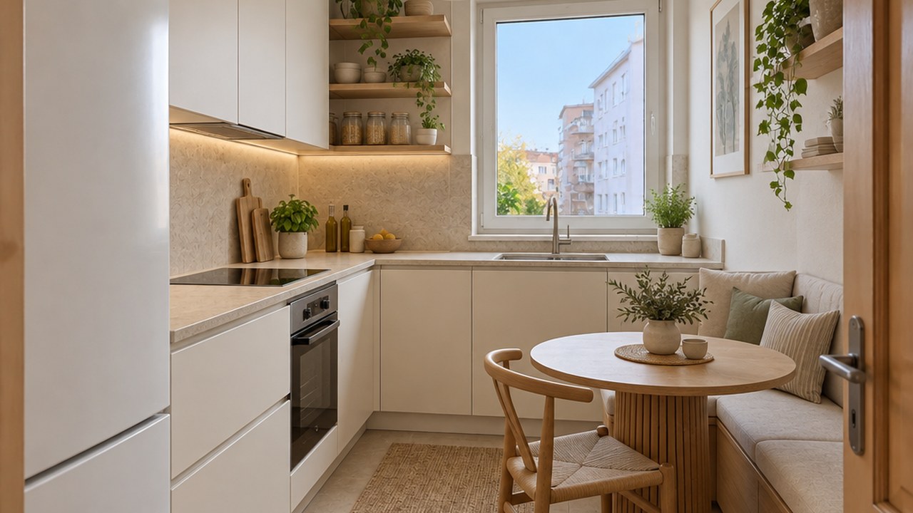
A real result from GenRoom Studio: the tiny L-shaped kitchen from case 2 below, same walls, same window, same door.
The small kitchen ideas that make the biggest difference are simple: one light color across cabinets and walls, flat handleless fronts that run up to the ceiling, open shelves in place of a few wall cabinets, light under the wall cabinets, and seating that folds away or tucks into a corner. What stops most people is not the list. It is not knowing which of these ideas will work in their kitchen, with their window, their door and their fridge in the way.
That is the question GenRoom users bring. Between March and mid-October 2026, 164 people asked GenRoom Studio to redesign a small kitchen in their own words. About 4 in 10 typed the size of the room, and about 4 in 10 listed appliances that still had to fit. So instead of another gallery of other people's kitchens, this guide takes three ordinary small kitchens (a dated galley, a tiny L-shaped kitchen with a table, and a one-wall kitchenette), runs the ideas on each photo in the Studio, and shows the unedited results, including the ones that went wrong.
You will also find the planning numbers that matter in a tight room, taken from the NKBA Kitchen Planning Guidelines, and a frank section on what the AI does not do: it does not draw your kitchen to scale.
What do people ask for when their kitchen is small?
People with small kitchens rarely ask for a style first. They ask for space, light and a place for every appliance. Here are typical requests from the Studio, paraphrased and anonymised:
- "My kitchen is about 2.2 × 2.2 m, ceiling 2.6 m, no window. It still has to fit a fridge, an oven and a dishwasher. Natural wood, please."
- "Very small kitchen with very old appliances. Redesign it for a modern small apartment."
- "Add a fold-down table on the wall. It needs a fridge, an oven and a dishwasher too."
- "8 by 8 feet, a door on each side. Lots of storage for an older person who can't bend down."
- "This small kitchen opens onto the hallway and has a tiny window. Is it better to remove the wall?"
- "Very small kitchen. I want it a bit funky, but clean and fresh, with some colour."
- "One side is 120 cm, the front is 86 cm. I need a sink, a shelf for dishes and somewhere for spices. Japanese, minimal."
Three patterns stand out across the 182 requests these 164 people wrote:
| What people ask for | Share of requests | What it means for the design |
|---|---|---|
| Exact room size (metres or feet) | about 38% | They want a plan, not a mood board |
| A list of appliances that must fit | about 40% | Fridge, oven and dishwasher come first, style second |
| Somewhere to eat (table, bar, nook) | about 15% | Seating has to share the floor with the work aisle |
| "Bigger", "more space", "open it up" | about 15% | The goal is a room that feels larger |
The first two points matter for the rest of this article. An AI image is very good at showing how a small kitchen will look with new cabinets, colours, shelves and light. It is much weaker at proving that a 60 cm dishwasher physically fits next to your sink. We come back to that in the limits section.
Which small kitchen ideas actually make a kitchen feel bigger?
A small kitchen feels bigger when the eye meets fewer edges, fewer colours and fewer shadows. Every idea below works on one of those three. The right-hand column is what you can type into the Studio to try it.
| Idea | Why it helps in a small kitchen | What to type in the Studio |
|---|---|---|
| One light colour for fronts and walls | Fewer contrasting blocks, so the walls seem to recede | "light warm-white cabinets, walls the same tone" |
| Flat handleless fronts | No knobs or frames to catch light and break up the surface | "flat handleless fronts" |
| Wall cabinets up to the ceiling | No dusty gap on top; one tall plane instead of two levels | "cabinets up to the ceiling" |
| Open shelves instead of some wall cabinets | Shows the wall behind, which reads as depth | "open shelves instead of the wall cabinets next to the window" |
| Under-cabinet lighting | Removes the shadow on the worktop, the darkest strip in most small kitchens | "under-cabinet lighting" |
| Integrated or tall-column fridge | Hides the largest object in the room behind a matching front | "integrated fridge in a tall column" |
| Corner bench or fold-down table | Seating without chairs that stick into the aisle | "corner bench with a small round table" |
| A rug or flooring laid lengthwise | Pulls the eye along the long side of a galley | "a runner along the galley" |
Two ideas are missing on purpose. Mirrored backsplashes and high-gloss everything do bounce light, but they also show every splash and fingerprint in a room where you cook at arm's length from the wall. And knocking down a wall is not a decorating idea; it is a structural project with its own guide: how to visualize removing a wall for an open floor plan.
How do you try small kitchen ideas on a photo of your own kitchen?
You upload one photo, pick the Kitchen remodel mode, choose how far to go, describe your small-kitchen wishes, and press Create design. A design costs 2 credits, and the free account gives you 6 credits without a card. In our test, each kitchen design took 17 to 24 seconds to generate.
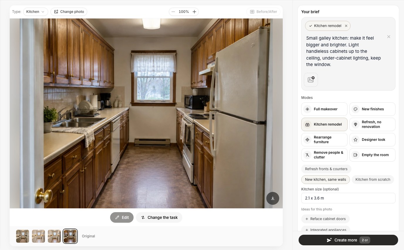 The Studio design screen: Kitchen remodel mode, the "New kitchen, same walls" option, the optional Kitchen size field and our wish in plain words.
Step by step:
- Take the photo from the doorway, at eye level, with the long side of the kitchen in view. Turn the lights on and open the blinds. A wide phone photo is fine.
- Upload it in the Studio (or start from the AI kitchen design page). It recognises the room as a kitchen and shows the modes.
- Pick Kitchen remodel, then one of its three options:
- Refresh fronts & counters: new fronts, worktop and backsplash on the same cabinet layout. The closest to a weekend-and-painter budget.
- New kitchen, same walls: a new cabinet layout, fronts, worktop, appliances and lighting inside your existing walls, window and door. Best for most small kitchens.
- Kitchen from scratch: the freest option, for a kitchen you would rip out completely.
- Optionally fill in Kitchen size (for example "3 x 4 m" or "10 x 13 ft"). It is sent to the AI with your wish. Read the limits section before you rely on it.
- Write your wishes in one or two sentences: what must stay, what must fit, and the look. Name the idea, not the brand: "light handleless cabinets up to the ceiling, under-cabinet lighting, keep the window".
- Press Create design, then refine. The Edit button opens the editor, where you can change one thing with words or select an area with a brush or lasso and redo only that part.
Below the options, the Studio also suggests Ideas for this photo. For our galley it offered "Reface cabinet doors" and "Integrated appliances", which fit a small kitchen well. The Kitchen task group adds single changes such as Cabinet color, Countertop and Backsplash if you only want to test one thing.
If you only want paint, handles and lighting with no new cabinets, the guide to updating a kitchen without remodeling covers the Refresh, no renovation mode in detail. This article is about making a small kitchen work.
Case 1: a dated galley kitchen made lighter
The galley is the most common small kitchen and the easiest to improve, because its problem is almost always colour and light, not layout. Ours had honey-oak raised-panel doors on both sides, wall cabinets that stopped short of the ceiling, a single ceiling light and a big almond fridge right at the entrance.
We chose New kitchen, same walls and typed: "Small galley kitchen: make it feel bigger and brighter. Light handleless cabinets up to the ceiling, under-cabinet lighting, keep the window."
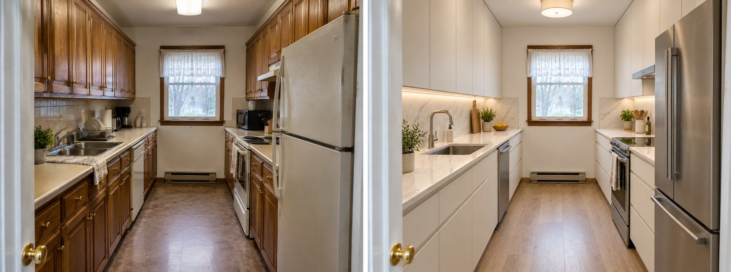 Left: the original galley. Right: the unedited Studio result. The window, the door, the radiator and the camera stayed where they were.
What changed, and why it works:
- The wall cabinets now reach the ceiling and the dusty gap above them is gone. The two walls read as two calm planes instead of a stack of framed boxes.
- The fronts are flat and handleless. In a galley you see the doors at a sharp angle, so every knob and panel edge shows. Removing them is the single biggest visual gain.
- A strip of light runs under the wall cabinets. The worktop was the darkest part of the original photo.
- The aisle looks the same width. The AI did not widen the room to make it look better, which is what you want from a "same walls" design.
The AI also swapped the vinyl floor for light wood, replaced the almond appliances with stainless ones and lost the paper towel holder and the dish rack. Those are reasonable choices, but they were not in the wish. If you want to keep your fridge, say so in the wish.
Same galley, two budgets
The same photo with the cheaper option, Refresh fronts & counters and no wish, keeps the cabinet layout and the old appliances. It changes the fronts, the worktop, the backsplash and the lighting.
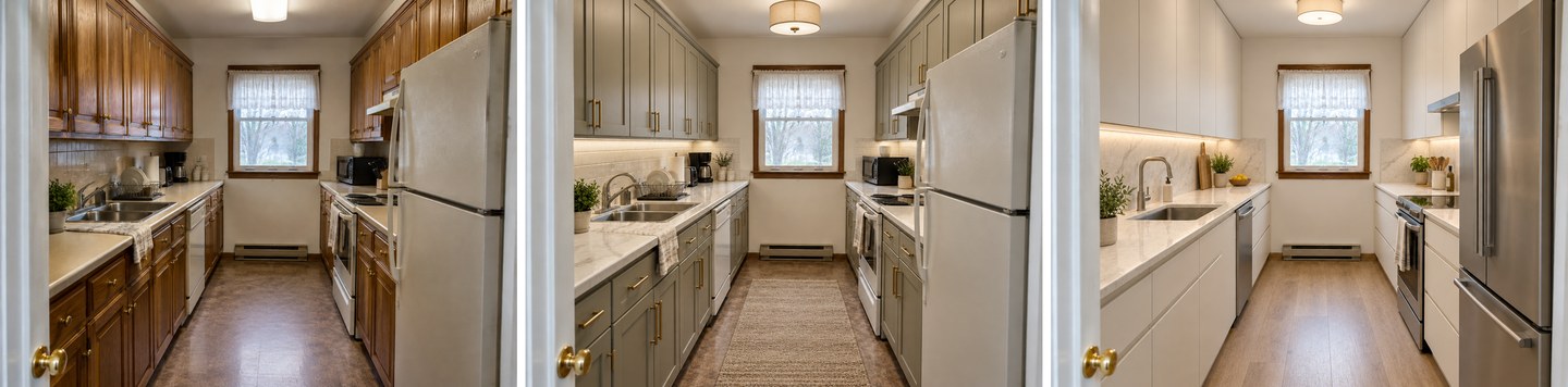 Original / Refresh fronts & counters (no wish) / New kitchen, same walls (with the wish above). Same photo, two budgets.
The refresh chose sage-grey shaker doors with brass pulls and added a jute runner along the aisle. It is a pleasant kitchen, but it still has handles, panel frames and two levels of cabinets, so it feels smaller than the right-hand version. That is the honest trade-off: painted or refaced fronts are much cheaper than new cabinets, while handleless fronts to the ceiling do more for the sense of space. The kitchen cabinet visualizer guide shows how to test front colours and door styles one at a time.
Case 2: a tiny L-shaped kitchen with a table in the way
The tiny L-shaped kitchen is the classic apartment layout: cabinets on two walls, a fridge by the door, and a table squeezed into the remaining corner, where it blocks the door and the oven. Ours had cream gloss doors with long bar handles, a brown laminate worktop, patterned wall tiles and a square table with two chairs.
We chose New kitchen, same walls and typed: "Tiny L-shaped kitchen: light colors, flat handleless fronts, open shelves instead of the upper cabinets next to the window, and replace the table with a compact dining nook: a corner bench with a small round table."
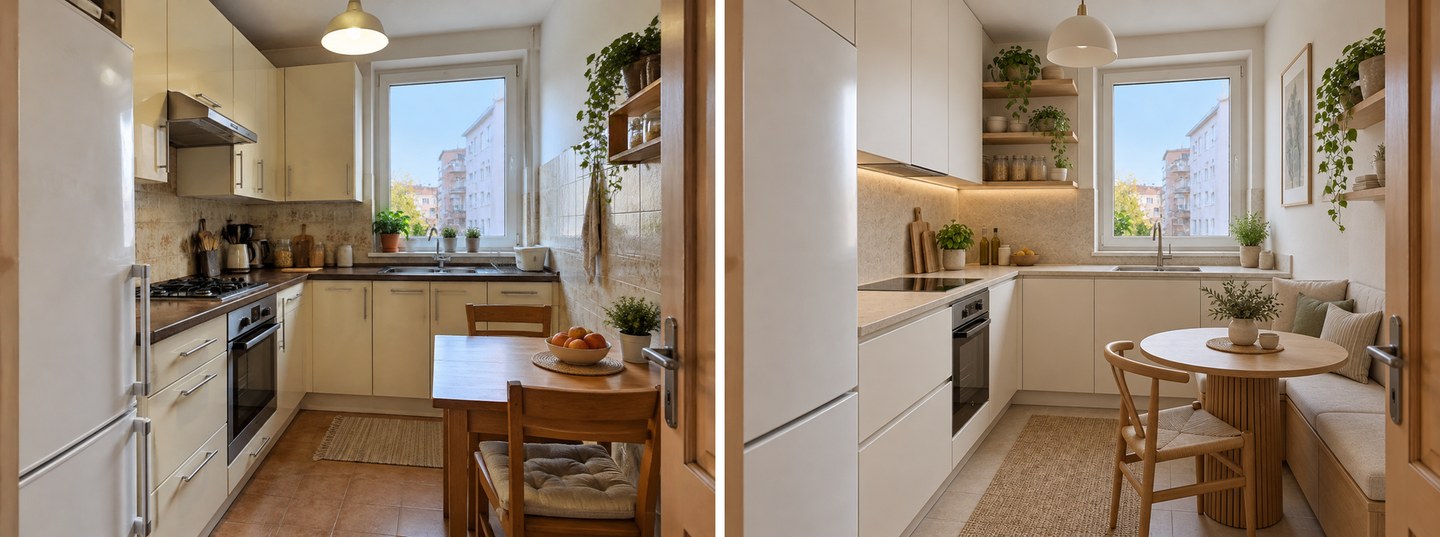 Left: the original. Right: the unedited Studio result. Same window, same view, same door.
This one shows why small kitchen ideas work best together:
- The corner bench replaces two chairs. A bench along the wall needs no space to pull out, so the floor in front of the oven is clear.
- A round pedestal table has no corners to walk into and one central leg instead of four.
- Open shelves sit only at the corner by the window. The rest of the wall cabinets stayed, so storage is not sacrificed for the look.
- The fridge is now behind a tall front that matches the cabinets, so the largest object in the room disappears.
- Under-cabinet lighting again fixes the dark worktop.
Check the details before you take this to a kitchen fitter. The AI replaced the gas hob with an induction hob, swapped the boxy hood for one built in under the wall cabinets and added a framed print and a rug. All of that may be right for you, but it is the AI's choice, not yours.
Changing just the table: Select area
Sometimes you do not want a whole new kitchen, only a better solution for one corner. For that, open the result or the original in the editor, press Select area, outline the part you want to change with the lasso and describe it.
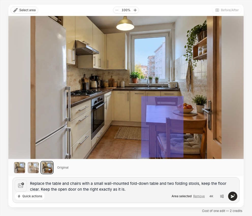 The editor: the selected area is shaded in blue, the request is typed below. One edit costs 2 credits.
We selected the table and typed: "Replace the table and chairs with a small wall-mounted fold-down table and two folding stools, keep the floor clear. Keep the open door on the right exactly as it is."
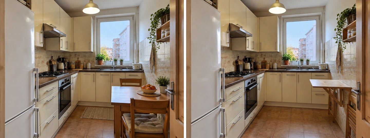 Only the table changed. The cabinets, worktop, tiles, window and door are the original ones.
The result is a drop-leaf table hinged to the tiled wall, with folding stools beside it. The cabinets, tiles and window are untouched. The rug in front of the sink disappeared too, because we asked for a clear floor. The edit took about 40 seconds, longer than a full design, because the AI matches the new part to the rest of the photo.
Case 3: a one-wall kitchenette in a studio flat
A kitchenette has a different problem: it is part of the living room, so it should look like furniture, not like a kitchen. Ours was a standard white run of cabinets, about 2.4 m long, with an under-counter fridge, a two-burner hob, a microwave on the worktop and a bare bulb above.
We chose Kitchen from scratch and typed: "Compact one-wall kitchenette for a studio flat: handleless cabinets up to the ceiling, a tall column with fridge-freezer and oven at the left end, two-burner hob, sink, a slim open shelf, under-cabinet lighting."
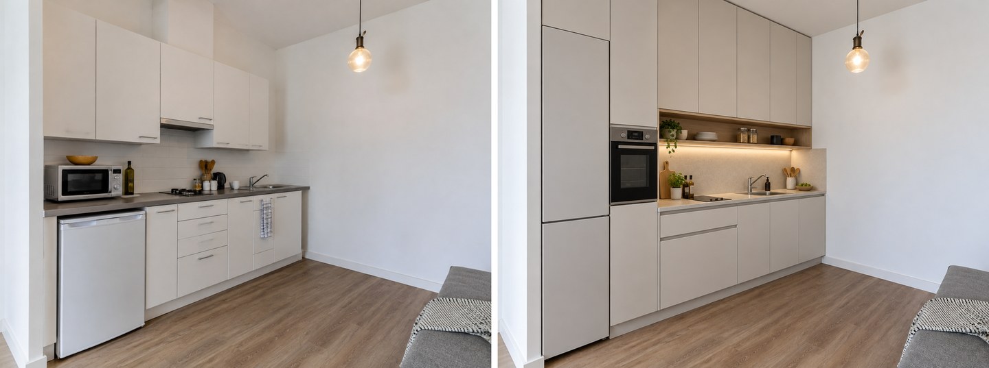 Left: the original kitchenette. Right: the unedited Studio result. The pendant, the floor and the sofa in the corner of the frame are unchanged.
The kitchenette now reads as one built-in wall: a tall column with an integrated fridge-freezer, an oven at eye level in the next tall unit, cabinets to the ceiling, and a wood-lined open shelf with lighting under it. The microwave on the worktop is gone.
Look at the worktop, though. The two tall units take a large share of the run, so the free counter between the hob and the sink is now short. That is the real cost of a tall column in a kitchenette. The NKBA guidelines recommend at least 24 inches (61 cm) of landing space on one side of a sink and 18 inches (46 cm) on the other, and 12 and 15 inches (30 and 38 cm) on either side of a hob. On a 2.4 m run, a tall column plus a sink plus a hob leaves very little worktop to chop on. The picture will not tell you that; a tape measure will. For layout ideas around a kitchenette, see studio apartment design with AI.
Create interior design with AI
Upload a photo of your room and get a professional design in 30 seconds. First generation is free.
Galley, L-shape or one-wall: what works in each?
Each small layout has one weak spot, and most small kitchen ideas are about fixing that spot. This table combines what we saw in the three tests with the NKBA planning guidelines.
| Layout | Typical weak spot | Ideas that helped in our tests | Watch out for |
|---|---|---|---|
| Galley (two parallel runs) | Dark, tunnel-like, doors at a sharp angle | Handleless fronts, cabinets to the ceiling, under-cabinet light, one colour | Aisle under 42 in (107 cm) for one cook; fridge door hitting the opposite run |
| Tiny L-shape | Table blocks the door and the oven | Corner bench, round pedestal table or fold-down table, tall fridge front | Corner cabinets that are hard to reach; seating clearance behind diners |
| One-wall kitchenette | Looks like a kitchen inside the living room | Built-in tall column, fronts to the ceiling, one open shelf | Tall units eating the worktop; little landing space next to the hob and sink |
If your kitchen opens to a living area and you have room for a peninsula or a small island, the kitchen island visualizer guide explains how to test one and how much aisle it needs.
Which measurements matter in a small kitchen?
A small kitchen can look perfect in a picture and still be miserable to cook in. The NKBA Kitchen Planning Guidelines, published by the National Kitchen & Bath Association, give the numbers that designers use to check a plan. These are recommendations, not building code; local codes may apply.
| What | NKBA recommendation | Why it matters in a small kitchen |
|---|---|---|
| Work aisle (between counters, tall units, appliances) | At least 42 in (107 cm) for one cook, 48 in (122 cm) for two | The most common reason a galley feels cramped |
| Walkway with no work in it | At least 36 in (91 cm) | The path from the door to a dining nook |
| Work triangle (hob, sink, fridge) | Total no more than 26 ft (7.9 m); each leg 4–9 ft (1.2–2.7 m) | Small kitchens usually pass easily; check that no leg is under 4 ft |
| Traffic through the triangle | No major traffic path should cross it | A second door in a galley often breaks this rule |
| Sink landing area | 24 in (61 cm) on one side, 18 in (46 cm) on the other | Where the dish rack and chopping board go |
| Hob landing area | 12 in (30 cm) on one side, 15 in (38 cm) on the other | Never put a hob right against a tall unit or wall |
| Fridge landing area | 15 in (38 cm) on the handle side or across the aisle within 48 in (122 cm) | Somewhere to put the shopping down |
| Space behind a seated diner | 32 in (81 cm) if nobody passes; 36 in (91 cm) to edge past; 44 in (112 cm) to walk past | Decides whether a table fits in an L-shaped corner |
| Seat width | 24 in (61 cm) per person | A bench for two needs about 120 cm |
| Lighting | Task lighting on every work surface, from several sources | Under-cabinet light is not decoration, it is a guideline |
Measure your room before you trust any picture, including ours. Then use the numbers as a checklist against the design you like.
Where does the AI get small kitchens wrong?
AI is a fast way to see whether an idea suits your kitchen. It is not a measuring tool. These are the problems we hit while shooting this article, and how to work around each one.
It always says yes, even when the room says no
We asked the tiny L-shaped kitchen for everything at once: "a full-size fridge-freezer, an oven, a 60 cm dishwasher, a washing machine and a dining table for four people", with a typed size of 2.5 x 2.7 m.
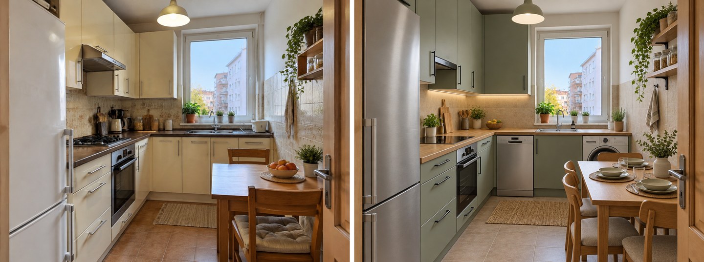 Left: the original. Right: the unedited result. Everything "fits", but the table for four stands right where the door opens.
Every item is in the picture: a stainless fridge-freezer, an oven, a dishwasher, a washing machine under the window corner and a table set for four. But the table is pushed against the door, and there is nowhere near the 32–44 inches the NKBA suggests behind a seated diner. In a real room, this kitchen does not work. When the wish lists more than the room can hold, the AI squeezes things in instead of telling you. Ask for fewer things, or check the result against the measurements above.
Typing the room size does not make the picture to scale
The Kitchen size field and any dimensions in your wish are sent to the AI. In our galley, adding "2.1 x 3.6 m" produced almost the same kitchen as the run without it.
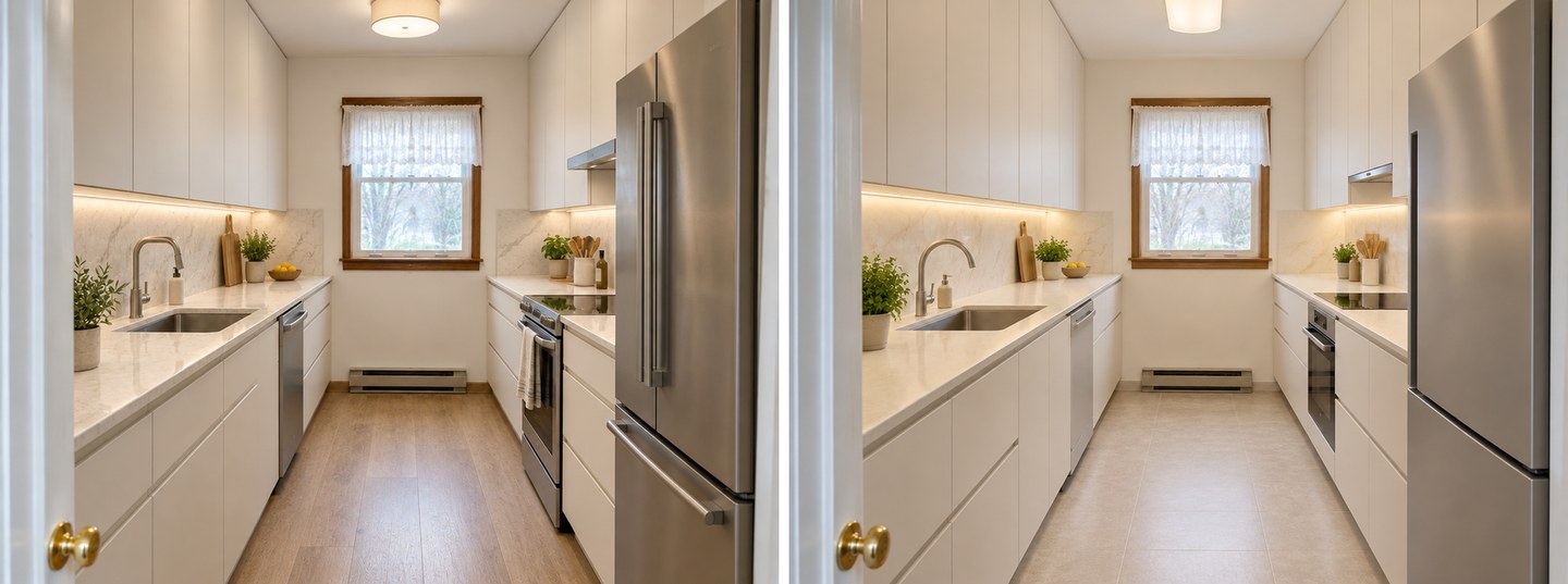 Left: without a size. Right: with "2.1 x 3.6 m" in the Kitchen size field. Same wish, almost the same kitchen.
That is not a failure in this case, because the photo already shows the real proportions. But it is a warning: the AI does not calculate that a 60 cm appliance fits in a 58 cm gap. Treat sizes as context, never as a guarantee, and use a kitchen planner or a fitter's drawing for the final layout. The comparison of AI kitchen design tools explains which tools work from measurements and which from photos.
An edit can change things outside your selection
In our first try of the fold-down table, we outlined only the table. The table changed as asked, but the open door at the edge of the photo disappeared.
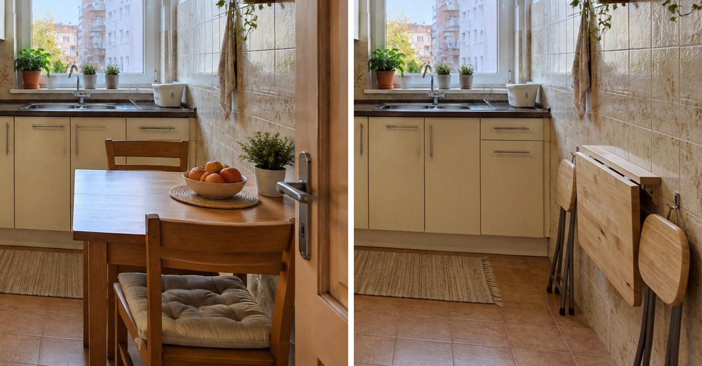 Left: the original corner with the open door. Right: the first edit. The door was outside the selection, but it was removed anyway.
The fix was simple: we added "Keep the open door on the right exactly as it is" to the request and ran it again (the result in case 2). If something next to your selection matters, name it in the request.
Other things to check in every result
- The room can grow a little. In "same walls" designs the AI sometimes extends a cabinet run by a few centimetres or straightens a wall. Compare the corners with your photo.
- Appliances get swapped. Our gas hob became induction, almond appliances became stainless. If you are keeping an appliance, say so.
- Clutter disappears. Dish racks, kettles and paper towels vanish because the AI stages the kitchen. In real life they need a home, so plan storage for them; the built-in storage ideas guide helps.
- Lighting looks better than it will be. The renders are bright and evenly lit. Real under-cabinet strips need a power supply and a plan; see AI lighting design from a room photo.
Should you remove a wall to make a small kitchen bigger?
Removing a wall makes a small kitchen bigger in fact, not just in feel, but it is a structural and often expensive job that needs a builder or engineer to check what the wall carries. Before you go there, try the ideas in this article first: light colours, handleless fronts, open shelves and better light often solve the "cramped" feeling for the cost of new fronts. If the kitchen still feels closed in, visualize the open floor plan on your own photo before you talk to a builder.
FAQ
What is the best layout for a small kitchen?
It depends on the room's shape. A galley suits a narrow room and keeps everything within a step or two. An L-shape suits a squarer room and leaves a corner for a small table or bench. A one-wall kitchen suits a studio or an open-plan space. In each case, keep at least 42 inches (107 cm) of aisle for one cook, as the NKBA recommends.
How can I make my small kitchen look bigger without renovating?
Paint the cabinets and walls in one light colour, swap knobs for slim pulls or none, clear the worktops, add under-cabinet lighting and replace a heavy table with a round or fold-down one. You can preview these changes on a photo of your kitchen in GenRoom Studio with the Refresh, no renovation mode, or one at a time with tasks such as Cabinet color.
Are open shelves a good idea in a small kitchen?
Yes, in small doses. Replacing one or two wall cabinets near a window with open shelves makes the wall feel deeper and lighter. Replacing all of them loses storage you will miss and puts every item on display. In our L-shaped test, shelves only in the window corner kept most of the storage.
Can AI design a small kitchen to my exact measurements?
Not reliably. GenRoom sends your measurements to the AI as context, but the result is a photorealistic picture, not a scaled drawing. It is excellent for choosing colours, fronts, shelves, lighting and seating. For the final cabinet sizes, use a measured plan from a kitchen planner or a fitter.
Is a dining nook possible in a very small kitchen?
Often, yes, if you use a bench or a fold-down table instead of chairs. A bench along the wall needs no pull-out space, and a wall-mounted drop-leaf table folds away while you cook. The NKBA suggests at least 32 inches (81 cm) behind a seated diner when nobody walks past, and about 24 inches (61 cm) of width per person.
How much does it cost to try small kitchen ideas on my photo with GenRoom?
A free account gives you 6 credits without a card. Each design or edit costs 2 credits, so you can try three ideas for free. After that, credit packs start at $9.99 for 36 credits, with no subscription. See pricing for the current plans.
The Bottom Line
The small kitchen ideas that worked best in our tests were the quiet ones: one light colour, flat fronts to the ceiling, light under the wall cabinets, a few open shelves, and seating without chairs. Trying them on your own photo shows in under a minute which ones suit your room. Just remember what the picture cannot do: it will happily squeeze in a table for four where only two fit. Pick the look in the Studio, then check it against a tape measure and the NKBA numbers above. Upload your kitchen photo to GenRoom Studio and try the first idea now.