Transitional Interior Design: The Complete AI Guide (2026)
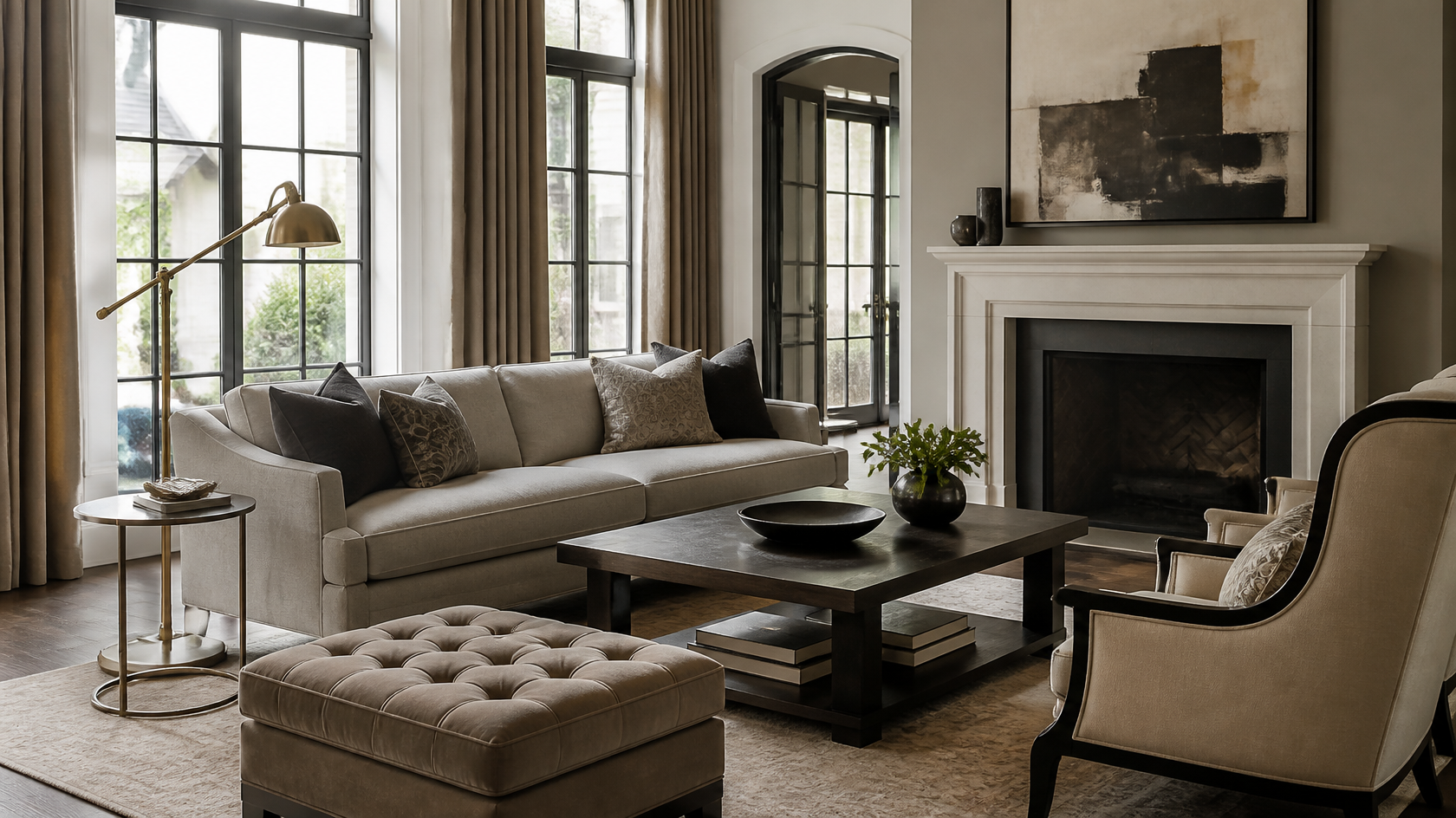
Transitional design is the answer to a question most homeowners are quietly asking: how do I get a room that feels current without feeling cold, and warm without feeling dated? It is the deliberate middle ground between two opposites — the ornament, comfort and history of traditional design, and the clean lines, restraint and openness of modern design. Done well, it produces a room that looks like it was assembled slowly by someone with taste, rather than ordered in one click from a catalogue or a showroom.
The reason transitional is the most-requested style in American interior design — and increasingly across Europe and the Middle East — is that it ages gracefully. A purely trend-led room looks tired in three years. A transitional room, built on neutral foundations and balanced proportions, still reads as intentional a decade later. This is the guide we wished existed when we started visualising transitional rooms for clients on GenRoom: a precise definition, the 2026 palette, a room-by-room playbook for seven rooms, the difference between transitional and its two parent styles, the mistakes that flatten the look, and an AI interior design workflow that lets you test the whole thing on a photo of your actual room in under a minute.
What Transitional Design Actually Is (And Isn't)
Transitional design is the intentional, balanced blend of traditional and contemporary styles in a single space. It is not "traditional with a few modern things," and it is not "modern softened with a rug." It is a 50/50 marriage in which neither parent style dominates, held together by a neutral palette and a disciplined sense of scale.
The mistake people make is treating transitional as a default — the safe beige room you land on when you can't decide. That produces the flat, personality-free spaces that give the style a bad name. Real transitional design is an active negotiation: for every ornate element (a carved leg, a tufted headboard, a curved arm), there is a clean-lined counterweight (a slab door, a flat-front cabinet, a straight silhouette). The tension between the two is the entire point.
Three principles govern every decision:
- Balance over matching. Nothing in a transitional room is part of a "set." A modern sofa sits with a classic wingback chair; a traditional rug grounds a contemporary table. The pieces converse rather than match.
- Neutral foundation, textural depth. Colour is restrained — beige, greige, taupe, charcoal, off-white — so the interest comes from texture: linen against velvet, polished marble against woven wool, matte wood against brushed brass.
- Comfort with restraint. Traditional design can over-decorate; modern design can under-furnish. Transitional keeps the comfort of the first and the editing discipline of the second.
Transitional design is what happens when traditional grows up and modern warms up, and they meet exactly in the middle.
Get the balance wrong in either direction and the room slides back into being plainly traditional or plainly modern. Get it right and it reads as timeless — the single most valuable adjective in residential design.
The 2026 Transitional Colour Formula
The foundation of any transitional room is a warm neutral base with one grounded accent and zero loud colour. The base does the structural work; the accent supplies the personality; texture supplies the depth. A reliable starting split is 70-20-10: 70% warm neutral on walls, large furniture and rugs; 20% wood and stone as the structural materials; 10% accent in a single richer tone.

The big 2026 shift is warmth. The 2018-2022 transitional palette leaned cool and grey — greige that tipped toward concrete. The current direction is earthier and more comfortable: wheat, caramel, terracotta, mushroom and warm taupe with greige undertones, plus a willingness to use one genuinely rich accent (oxblood, deep teal, mossy green, soft mauve) where the older formula would have stayed safely neutral.
The Core 2026 Palette
| Role | Colour | Paint Codes | Where to Use It |
|---|---|---|---|
| Warm white | Soft white / bone | Benjamin Moore White Dove, Sherwin-Williams Alabaster, Farrow & Ball Pointing | Ceilings, trim, secondary walls |
| Warm greige | Mushroom / wheat | Benjamin Moore Edgecomb Gray, Sherwin-Williams Accessible Beige, Farrow & Ball Skimming Stone | Main wall colour |
| Warm taupe | Caramel-leaning neutral | Benjamin Moore Manchester Tan, Sherwin-Williams Natural Linen | Large furniture, cabinetry |
| Deep anchor | Charcoal / soft black | Benjamin Moore Kendall Charcoal, Sherwin-Williams Iron Ore, Farrow & Ball Railings | One feature wall, doors, frames, fixtures |
| Warm accent | Terracotta / caramel | Benjamin Moore Audubon Russet, Sherwin-Williams Cavern Clay | Single textile, pottery or accent chair |
| Cool accent | Deep teal / mossy green | Benjamin Moore Hale Navy, Farrow & Ball Green Smoke | One armchair, cabinet or velvet pillow |
| 2026 statement | Oxblood / soft mauve | Benjamin Moore Pottery Red, Sherwin-Williams Quietude | Dining accents, a single bold moment |
The single most important rule is the accent count: one accent direction per room, used in two or three places, no more. The fastest way to lose the transitional balance is to add a second and third accent colour until the room becomes "eclectic" — a different style entirely.
Transitional vs Modern vs Traditional
The biggest source of confusion in transitional search results is the three-way overlap with its parent styles. Each has a clear distinguishing axis, and seeing them side by side is the fastest way to understand what transitional actually is.
| Dimension | Traditional | Transitional | Modern |
|---|---|---|---|
| Lines | Ornate, carved, curved | Mix of clean and curved | Straight, minimal, flat |
| Palette | Rich, layered, warm | Neutral base + one accent | Stark white, black, bold pops |
| Furniture | Substantial, detailed, formal | Substantial but simplified | Light, sleek, low-profile |
| Symmetry | Highly symmetrical | Balanced, not rigidly matched | Asymmetrical, free |
| Texture | Patterned, decorative | Layered neutral textures | Smooth, hard, sparse |
| Decor | Abundant, collected | Curated, edited | Minimal, almost bare |
| Feeling | Formal, historic, cosy | Timeless, warm, calm | Crisp, gallery-like, cool |
The shorthand: if the room is ornate, symmetrical and richly decorated, it is traditional. If it is sparse, straight-lined and almost empty, it is modern. If it is comfortable, neutral, lightly curated and built on the tension between a classic piece and a clean one, it is transitional.
A common cousin worth distinguishing is modern traditional (sometimes "grandmillennial"), which leans about 70% traditional with modern touches — more pattern, more ornament, more colour. Transitional sits squarely at 50/50 and stays more neutral. If you find yourself adding floral wallpaper and a gallery wall, you have crossed from transitional into modern traditional.
Transitional Living Room
The transitional living room is the room that defines the style for most people, and the room where the 50/50 balance is most visible. The anchor move is one substantial sofa with clean lines, paired with one piece that has classic detailing — a curved-back wingback chair, a tufted ottoman, or a skirted club chair.

A well-executed transitional living room has a neutral sofa in linen, cotton or leather (greige, taupe or soft charcoal, clean-lined but comfortable), an upholstered ottoman used as a coffee table (the single most transitional object — soft form, hard function), a layered rug that grounds the seating, one statement light with a simple silhouette in brushed brass or bronze, and one large piece of abstract art above a classic fireplace mantel. The contrast between the traditional mantel and the modern art is the whole style in one wall.
Texture carries the room because colour is restrained. Mix a linen sofa with velvet pillows, a wool rug with a leather bench, smooth marble on a side table with a woven basket on the floor. The rule of thumb: if you can name three distinct textures from the doorway, the room is working.
In a transitional room, the textures do the talking the colours refuse to.
The trap is symmetry. Traditional rooms are rigidly symmetrical — matching lamps, matching end tables, a mirror dead-centre. Transitional rooms are balanced but not matched: a tall lamp on one side answered by a stack of art books and a sculpture on the other. Visual weight is equal; the objects are not twins.
Transitional Bedroom
The transitional bedroom is the easiest room to get right because the brief is naturally calm. The defining move is an upholstered bed with a softly shaped headboard — a low wingback, a gentle curve, or a clean panel with subtle detailing — dressed in layered neutral bedding.

A transitional bedroom needs:
- An upholstered bed in linen or performance fabric, neutral, with a clean-but-shaped headboard
- Layered bedding in white, greige and taupe — texture over pattern, with one accent pillow at most
- A velvet or leather bench at the foot of the bed (the comfort-meets-restraint piece)
- Walnut or dark-wood nightstands — they do not have to match each other, only balance
- Brushed brass or polished nickel lamps with simple shades
- Flowing linen curtains, floor to ceiling, on a slim metal rod
- One large piece of soft abstract art over the bed, nothing busy
- A wool or natural-fibre rug visible on three sides of the bed
Banish: the heavily carved four-poster (too traditional), the stark platform with no headboard (too modern), bedding in four competing patterns, and matching "bedroom sets" where every piece is the same wood and finish. The set is the enemy of transitional — it removes the curated tension that makes the style read as collected over time.
Transitional Kitchen
The transitional kitchen is the single most popular kitchen style in the United States, and for good reason: it photographs beautifully, resells well, and rarely dates. The formula is Shaker-style cabinets in a warm neutral, paired with one clean modern element and one classic one.

Shaker cabinets are themselves transitional by nature — a recessed panel that reads as traditional, with a profile clean enough to read as modern. Paint them in soft greige, warm white or a muted green-grey, top them with honed marble or quartz, and you have the spine of the room. The brass or bronze pendant lights over the island supply the warmth; the slab-front island or the handle-free lower cabinets supply the modern edge.
The backsplash is the decision that tips a kitchen one way or the other. Standard glossy subway tile reads slightly modern; classic marble in a brick or herringbone lay reads slightly traditional — either works, as long as it is the only pattern in the room. Avoid busy mosaic or bold geometric tile; the pattern budget in a transitional kitchen is one element, spent carefully.
Stools, not bar chairs, and ideally with a woven or leather seat to add a third texture against the painted cabinets and stone counter. Two or three, in a natural material, 65cm seat height for a standard island.
Transitional Dining Room
The transitional dining room is where the 2026 colour shift shows up most. The instinct now is to let the dining room go slightly richer than the rest of the house — a deep teal accent wall, oxblood upholstered host chairs, or a moody artwork — while keeping the bones neutral.

The defining move is the chair mix: upholstered host chairs (often with a subtle classic profile) at the heads of the table, paired with simpler clean-lined side chairs along the length. They share a palette but not a silhouette — exactly the transitional negotiation in furniture form. The table itself is usually a substantial dark wood — walnut or stained oak — with a simple top and legs that read as neither carved nor industrial.
A single chandelier with a clean silhouette anchors the room. Brushed bronze, aged brass or matte black with simple geometry; never a crystal showpiece (too traditional) and never an exposed-bulb cage (too industrial-modern). Hung 80-85cm above the table surface.
Keep the table itself disciplined — a textural linen runner, two or three ceramic vessels of varying heights, and nothing else. The richness lives in the walls, the wood and the upholstery, not in clutter on the surface.
Transitional Bathroom
The transitional bathroom converges with the high-end spa look, which is why it is one of the most rewarding rooms to convert. The four moves are: a wood vanity with clean lines, honed marble or quartz counters, classic tile in a neutral palette, and mixed metals used deliberately — brushed brass on the fixtures, polished nickel on the lighting, or matte black as a single grounding note.

A floating or furniture-style wood vanity in warm walnut or a painted neutral supplies the warmth; the honed (not polished) marble supplies the quiet luxury without the showroom shine. Classic marble subway tile in the shower, a freestanding soaking tub if the floor plan allows, and a single large framed mirror — round or rectangular with a slim metal frame — rather than the frameless builder mirror or the ornate gilt antique.
Storage is disciplined: counters hold one or two objects, everything else lives behind the vanity doors. A wall-mounted shelf with a folded linen towel, a ceramic dish and a single plant is the entire decor budget. The transitional bathroom reads as expensive precisely because it is uncluttered.
Create interior design with AI
Upload a photo of your room and get a professional design in 30 seconds. First generation is free.
Transitional Home Office
The remote-work era turned the home office into one of the most-searched transitional applications, because the style photographs beautifully on video calls — warm enough to look like a home, edited enough to look professional. The brief concentrates the budget on three pieces: desk, chair, and the wall behind you.

A wood desk with clean lines and a hint of classic detailing, a tufted leather-and-wood chair (the comfort-meets-structure piece — never a mesh ergonomic chair, which breaks the look instantly), a brushed brass task lamp, and built-in or floating shelving with a curated mix of books laid both flat and upright, a few ceramic objects and one piece of art. The shelf is styled at about 60% full — fuller than a modern shelf, emptier than a traditional one.
The wall behind the desk is the most important surface if you appear on camera. A soft greige or warm taupe, one large framed abstract piece, and nothing else. Treat it as your portrait background: balanced, neutral, quietly expensive.
Transitional in a Small Apartment or Rental
Transitional is one of the most rental-friendly major styles, because almost all of its moves are object placements and textiles rather than built-ins. You do not need to retile, repaint or replace cabinetry to get most of the way to a transitional room.

The renter's transitional playbook:
- Anchor with one neutral sofa in linen or a slipcover, clean-lined but comfortable. This single piece sets the whole tone.
- Add one classic counterweight — a wingback or curved accent chair, a tufted ottoman, or a skirted bench. One traditional silhouette is enough.
- Layer textures, not colours. A wool rug, a velvet pillow, a woven basket and a marble-topped side table do more than any paint change.
- Swap the lighting to brushed brass or bronze with simple silhouettes, and warm the bulbs to 2700-3000K.
- Hang one large abstract piece rather than a gallery wall of small frames. Scale reads as intentional; clutter reads as student.
- Edit ruthlessly. Transitional fails most often from too much, not too little — remove a third of the objects and the remaining two-thirds read as curated.
For studios and under-40m² apartments, the highest-impact single move is choosing one oversized focal point — a large piece of art, a generous mirror, or a single substantial sofa — and keeping everything else modestly scaled. The contrast between one big gesture and a calm, edited surround is the transitional look in miniature.
Common Transitional Design Mistakes
Most "transitional" rooms fail in predictable ways, and almost every fix is a matter of editing or rebalancing rather than buying more.
| Mistake | Why It Reads Wrong | The Fix |
|---|---|---|
| All-neutral with no texture | Without textural contrast the room reads flat and sterile | Layer linen, velvet, wool, leather, marble and brass in one space |
| Buying everything at once | A matched "set" looks staged, not collected | Mix pieces you own with new ones; add over time |
| Too many accent colours | A second and third accent tips it into "eclectic" | One accent direction per room, used two or three times |
| Rigid symmetry | Matching everything pushes it back toward traditional | Balance visual weight without matching pieces |
| Furniture all one scale | Everything mid-sized reads monotonous | Add one or two oversized focal points |
| Over-decorating surfaces | Clutter is a traditional habit transitional rejects | Edit shelves and counters to 60% full |
| Cool LED lighting (4000K+) | Cool light makes warm neutrals look grey and cheap | Switch every bulb to 2700-3000K warm LED |
| Bold patterns competing | Multiple patterns break the neutral discipline | One pattern per room, neutral palette elsewhere |
| Going fully modern or fully traditional | Losing the 50/50 balance loses the style | For each clean piece, add one classic counterweight |
| Skipping the accent entirely | Pure neutral with no anchor reads as a builder showroom | Add one richer accent — terracotta, teal, oxblood |
The hardest mistake to see is the scale error. People keep every piece roughly the same size — sofa, chairs, coffee table, side tables all mid-scale — and the room reads as monotonous without anyone being able to say why. The fix is to introduce one or two genuinely oversized elements (a large artwork, an oversized lantern pendant, a deep sectional) so the eye has a hierarchy to follow.
How to Use AI to Visualise Your Transitional Room
The traditional way to test a transitional makeover is to order paint samples, drag furniture across showrooms, and argue about whether the greige is "too grey." The new way is to upload a photo of the actual room to an AI interior design tool and generate a photorealistic preview in under a minute.
GenRoom is built for exactly this. The workflow:
- Photograph the room in daylight, from a corner, with as much of the floor and one full wall visible as possible.
- Upload it to GenRoom, choose Interior Design, and select the Transitional style preset.
- Generate. You get a photorealistic render in roughly 30-60 seconds that preserves your room's architecture, windows and proportions while re-styling the furniture, materials and palette.
- Iterate. Try a warm-neutral version, a greige version, and a version with a single rich accent (teal, oxblood, terracotta) to see which suits your light.
- Refine with prompts. Add specifics — "swap to an upholstered wingback bed," "add a brushed-brass arc lamp," "use honed marble counters" — and re-generate.
- Shop to the render. Once you like a result, treat it as the brief: match the sofa profile, the wall colour and the lamp shape one piece at a time.
The advantage over a Pinterest board is that the render is your room. The proportions match your ceiling; the light comes from your windows. For deeper room-specific ideas, see our living room design playbook, and for the broader landscape of 2026 looks, our guide to interior design styles and trends.
GenRoom plans start at $9.99 for 36 credits (about 18 generations), with credits valid for 180 days — less than the cost of a single quart of designer paint, for unlimited iteration across every room in the house.
Transitional vs Other Popular Styles
Transitional is often confused with three neighbouring styles. Each blends old and new differently, and knowing the difference keeps your room from drifting.
| Style | What It Blends | Palette | Distinguishing Move |
|---|---|---|---|
| Transitional | Traditional + modern, 50/50 | Warm neutrals + one accent | Classic piece beside a clean piece |
| Modern Farmhouse | Rustic + modern | White, black, natural wood | Shiplap, barn doors, farmhouse sink |
| Mid-Century Modern | Retro + clean lines | Walnut, mustard, teal, white | Tapered legs, organic curves, iconic chairs |
| Modern Traditional | Traditional-leaning + modern | Richer, more pattern | More ornament and colour than transitional |
If you love the warmth but want rustic texture, our modern farmhouse interior guide is the next step. If you want the retro-modern edge instead of the classic-modern blend, see the mid-century modern home guide. Transitional is the most neutral and the most flexible of the four — which is precisely why it is the safest long-term choice for a whole-house style.
Budget Guide by Room
Transitional works at any budget, but the allocation matters. The biggest mistake is over-spending on a statement sofa and under-spending on lighting and textiles, which is exactly backwards.
| Room | Tight Budget | Mid Budget | Premium |
|---|---|---|---|
| Living Room | $700 (neutral slipcover sofa + thrifted wingback + wool rug + brass lamp) | $2500 (clean-lined linen sofa + tufted ottoman + abstract art + bronze lighting) | $9000+ (custom sofa + designer accent chair + marble tables + gallery art) |
| Bedroom | $550 (upholstered bed frame + layered linen bedding + thrifted nightstands) | $1800 (quality upholstered bed + velvet bench + walnut nightstands + brass lamps) | $5000+ (custom headboard + premium bedding + designer lighting + art) |
| Kitchen | $400 (paint cabinets greige + swap pulls to brass + add brass pendants) | $5000 (Shaker cabinet fronts + quartz counters + brass pendants + woven stools) | $30000+ (full reno: custom Shaker cabinets + honed marble + integrated appliances) |
| Bathroom | $300 (framed mirror + brass fixture swap + neutral tile accents + linen towels) | $2500 (floating wood vanity + honed quartz + classic tile + mixed metals) | $18000+ (freestanding tub + marble throughout + custom vanity + designer fixtures) |
| Dining Room | $500 (dark wood table + mixed thrifted chairs + bronze pendant) | $2200 (walnut table + upholstered host chairs + clean side chairs + chandelier) | $7000+ (custom table + designer chairs + statement lighting + accent wall) |
| Home Office | $400 (wood desk + leather-and-wood chair + brass lamp + one framed piece) | $1500 (quality desk + built-in shelving + designer chair + art) | $5000+ (custom millwork + premium chair + designer lighting + curated shelving) |
The single best-value swap at any budget is replacing one synthetic textile with a natural one — a wool rug, a linen slipcover, a velvet pillow. Texture is where transitional lives, and texture is cheaper than furniture.
Transitional Design for Different Climates
Transitional originated in temperate North American and European homes, but the neutral-and-balanced framework adapts cleanly to any climate.
Hot and arid (Middle East, US Southwest, parts of Australia): Lean the palette toward warm sand, terracotta and caramel, and favour stone, plaster and woven natural fibres over heavy upholstery. Brushed brass and matte black hold up well against bright direct light, where polished chrome would glare.
Tropical and humid (Southeast Asia, Mediterranean, Latin America): Reduce textile weight, use rattan and cane as the textural layer, and keep the palette a touch lighter and cooler. The classic counterweight comes from carved wood and woven detail rather than velvet and wool.
Cold and continental (Northern Europe, Canada, Northeast Asia): Lean into the comfort side — layered wool, velvet, deeper anchor tones, and warm 2700K lighting. This is closest to the original transitional recipe, where the traditional warmth carries the long dark months.
Frequently Asked Questions
What is transitional interior design in simple terms?
Transitional interior design is the balanced blend of traditional and modern styles in one space. It keeps the comfort, warmth and substance of traditional design and combines it with the clean lines, restraint and neutral palette of modern design. The result is a room that feels timeless rather than trendy — warm but not fussy, current but not cold.
What is the difference between transitional and modern design?
Modern design is defined by straight lines, minimal decoration, a stark palette (often white, black and bold accents) and an almost empty feeling. Transitional keeps the clean lines of modern but adds the comfort, warmth and occasional classic detail of traditional design, using a warm neutral palette and layered textures. In short: modern is crisp and sparse; transitional is calm and comfortable.
Is transitional style going out of style?
No — transitional is the opposite of a trend. Because it is built on neutral foundations, balanced proportions and timeless materials rather than fashionable colours or shapes, it ages gracefully. It has been the most-requested style in American interior design for over a decade precisely because it does not date. The 2026 update is a shift toward warmer neutrals and one richer accent, not a replacement of the style.
What colours are used in transitional design?
The base is warm neutrals: soft white, greige, mushroom, wheat, warm taupe and charcoal. The 2026 palette has shifted warmer (caramel, terracotta) and added the option of one richer accent — oxblood, deep teal, mossy green or soft mauve — used in just two or three places. The defining rule is restraint: one accent direction per room, never a riot of colour.
Is transitional the same as modern traditional or grandmillennial?
No, though they are close cousins. Modern traditional (sometimes "grandmillennial") leans roughly 70% traditional with modern touches — more pattern, more ornament, more colour, often floral wallpaper and gallery walls. Transitional sits at a true 50/50 and stays more neutral and edited. If you are adding lots of pattern and collected antiques, you have moved from transitional into modern traditional.
Can I mix transitional with my existing furniture?
Usually yes, and that is part of its appeal. Transitional thrives on mixing old and new, so a modern sofa with a classic chair, or an inherited dining table with contemporary chairs, is exactly right. The test is balance: for every clean-lined piece, keep one with classic detailing, and tie everything together with a neutral palette. You can typically keep 50-70% of existing furniture and still land a coherent transitional room.
What kind of lighting works best for transitional rooms?
Layered lighting in warm tones. Use a mix of ambient (a clean-silhouette chandelier or flush mount), task (table and floor lamps) and accent lighting, all at 2700-3000K. Fixtures should have simple silhouettes in brushed brass, bronze, polished nickel or matte black — sophisticated but not ornate. Avoid both crystal chandeliers (too traditional) and exposed-bulb industrial fixtures (too modern).
How do I keep a transitional room from looking boring?
Use texture and scale instead of colour. Layer at least three or four distinct textures — linen, velvet, wool, leather, marble, woven fibre, brushed metal — so a neutral room still has depth. Then introduce one or two oversized focal points (a large artwork, a generous mirror, a substantial sofa) so the room has a visual hierarchy. Finally, add a single richer accent. Boring transitional rooms are almost always under-textured, under-scaled, or missing their accent.
Final Thoughts
Transitional design is what you arrive at when you stop choosing between old and new and start negotiating between them. Keep the comfort and substance of traditional; borrow the discipline and clean lines of modern; hold the two in balance with a warm neutral palette and layered texture. The room that results is the rarest thing in residential design — one that will still look right in ten years.
The fastest way to commit is to test the look on a room you already own. Upload a photo to GenRoom, select the transitional preset, and generate a photorealistic render — neutral, warm-accent and richer-accent variations — in under three minutes. You will know from the first generation whether your room wants the pale palette or the deeper one, and whether your light supports walnut or a lighter wood. From there, the makeover becomes a sourcing exercise: match the sofa, balance it with one classic piece, layer the textures, add the single accent, and the room arrives.