Airbnb Interior Design Ideas That Raise Bookings (2026)
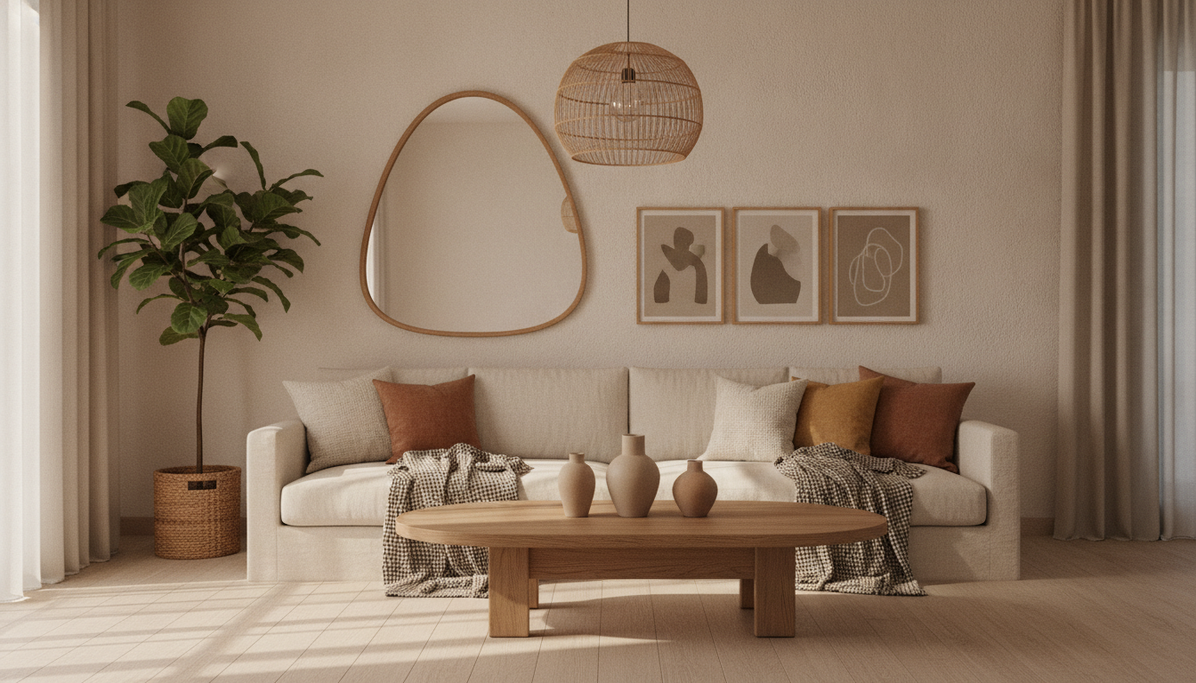
The Airbnb interior design ideas that actually raise bookings are the ones that read instantly in a thumbnail: one memorable focal point per room, warm layered lighting, a clear style, and clutter-free surfaces. Guests decide in about a second and a half, on a phone, whether to tap your listing — so the goal of every design choice is to make that first swipe stop. Everything else is secondary.
This guide is about redesigning the actual space to win bookings, not just editing the photos. If you specifically want to restyle or furnish your existing listing photos, our companion piece on AI virtual staging for Airbnb hosts covers that workflow in detail. Here we focus on the physical makeover: which rooms to change first, themed versus neutral, materials that survive high turnover, the 2026 trends worth your money, and how to preview the whole thing with a tool like GenRoom before you spend a cent on furniture.
A photogenic living room built around a few strong pieces — the kind of shot that stops a scroll.
Which Design Choices Actually Move Bookings?
The design choices that move occupancy and nightly rate are the ones that improve your photos, because photos are what guests shop. Location, price, and reviews matter, but within a given price band and area, the listing with stronger imagery wins the click — and clicks are what your calendar is made of. Airbnb's own hosting resources repeatedly emphasize high-quality photos as a top lever, and experienced hosts widely report the same pattern.
That reframes the whole project. You are not decorating a home for yourself; you are art-directing a set of ten to thirty photographs that have to perform on a 5-inch screen. Three principles follow directly from that:
- Design for the thumbnail. Bold, high-contrast, well-lit compositions survive being shrunk to a search-result tile. Subtle, tonal, "quietly tasteful" rooms often disappear at that size. If a room does not read at thumbnail scale, it does not earn the tap.
- One memorable thing per room. A statement headboard, an arched mirror, a sculptural light, a feature wall. This is the "halo effect": one impressive element makes guests rate the whole room — and the whole listing — as higher quality. Rooms with nothing to remember blur together with every other listing.
- Kill visual clutter. Empty counters, made beds, hidden cables, and clear floors instantly read as "clean and professional." Clutter is the single fastest way to make a nice space look cheap in a photo.
The practical takeaway: spend your budget where the camera looks. A $400 headboard that anchors your cover photo will out-earn $400 spread thinly across three rooms nobody photographs.
Themed or Neutral? How to Decide
Choose neutral-with-personality by default, and go fully themed only when the location or property genuinely supports it. A calm, warm-neutral base (off-white plaster, oak, linen, one or two accent colors) photographs beautifully, appeals to the widest set of guests, and is cheap to refresh. It is the safe, high-occupancy choice for city apartments and suburban homes.
Themed design — a coastal cottage, a desert adobe, a mid-century cabin, a Cappadocia cave room — is a different bet. Done well, it becomes the reason people book you specifically and screenshot your listing to friends. Done badly, it looks like a costume and ages fast. The rule of thumb: theme the place, not the trend. A Mediterranean villa earns lime-washed walls and terracotta; a generic downtown flat does not need a fake beach.
 A theme works when it grows out of the location — here, coastal Mediterranean details that feel earned, not applied.
A useful hybrid most hosts should aim for: neutral shell, local soul. Keep the big, expensive surfaces (walls, flooring, sofa, bed frame) neutral and durable, then layer in place through swappable pieces — local ceramics, regional artwork, a few well-chosen books, textiles that nod to the area. Listings whose top photos show a genuine sense of place tend to earn stronger interest than interchangeable beige boxes, and the local layer costs little and is easy to update.
Room-by-Room Quick Wins
The fastest booking gains come from upgrading the rooms guests photograph most: the primary bedroom, the main living area, and any outdoor space. Here is where to focus, roughly in order of return.
Bedroom: Sell Sleep, Then Style
The bedroom is where you win five-star reviews and repeat interest, so make it look like rest. The highest-impact moves are a genuinely comfortable mattress and hotel-grade white bedding (crisp, layered, with a textured throw folded at the foot), a statement headboard to anchor the shot, symmetrical bedside lamps or wall sconces for warm layered light, and blackout curtains — which guests notice and reviewers thank you for. Add one framed piece of local art above the bed and you have a photo that looks like a boutique hotel.
 A bedroom built to photograph like a hotel: headboard, layered white bedding, warm symmetrical lighting.
Living Room: Build One Great Composition
You do not need to furnish the whole room evenly — you need one great camera angle. Arrange seating around a clear focal wall (art, a mirror, or a feature paint color), add a statement light source, and layer texture with cushions, a throw, and a rug that fits the space properly (too-small rugs are the most common styling mistake). Keep coffee-table styling to three or four objects, max.
Kitchen and Dining: Clear, Warm, Functional
Kitchens rarely need renovation to photograph well — they need to be empty and warm. Clear the counters completely, add a single styled element (a bowl of fruit, a wooden board, fresh herbs), swap harsh overhead bulbs for warm-toned ones, and make sure the dining table is set simply. A $30 pendant light and warm bulbs often do more than new cabinets.
Bathroom: Make It Read as Spa-Clean
Fluffy white towels rolled or stacked, a plant, warm lighting, and spotless glass and grout. Matching hardware and a single framed print lift a plain bathroom into "cared-for" territory. Guests forgive a small bathroom; they do not forgive one that looks tired or dingy in photos.
Outdoor Space: Add Rooms You Already Own
A styled balcony, patio, or yard reads as extra square footage and directly raises perceived value. Two comfortable chairs, a small table, potted greenery, an outdoor rug, and warm string lights turn dead space into a hero photo. In good climates, an inviting outdoor shot can become the amenity that closes the booking.
 Styled outdoor space reads as bonus square footage — and photographs beautifully at golden hour.
Durable Materials That Survive Turnover
Choose materials that photograph like a boutique hotel but clean up like a rental, because a short-term listing takes years of wear in months. The design that raises bookings is worthless if it looks beaten up by month three. Prioritize:
- Performance fabrics (solution-dyed, stain-resistant weaves) for sofas and headboards instead of pale delicate linen or velvet that stains on first use.
- Engineered or laminate wood flooring and large-format tile over solid hardwood or fragile finishes — they resist scratches, spills, and rolling luggage.
- Semi-gloss or scrubbable paint in warm neutrals on high-traffic walls, so scuffs wipe off between stays rather than forcing a repaint.
- Darker or patterned rugs and runners that hide traffic and the inevitable spilled wine, rather than pale rugs that look grubby within weeks.
- Solid, simple furniture with replaceable parts and no fussy assembly. Avoid glass tabletops, sharp corners, and anything that wobbles.
 Turnover-proof materials — performance fabric, engineered wood, patterned textiles — keep the "new listing" look for years.
The mental test for every purchase: Will this still look photo-ready after 100 guests? If the honest answer is no, spend the money on the durable version. It is cheaper than restyling the room twice a year.
Airbnb Design Trends 2026 Worth Following
The 2026 trends worth your budget are the ones that improve photos and durability at once; skip anything that only looks good in person. Based on what is resonating with guests this year:
| Trend | Why it works for bookings | Verdict |
|---|---|---|
| Warm, earthy palettes (terracotta, sage, sand) | Cozy, natural, photographs warm on phones | Do it |
| Statement lighting (sculptural, woven, oversized) | Creates an instant focal point and "halo effect" | Do it |
| Moody accent walls / darker tones | High contrast survives the thumbnail; feels premium | Selective |
| Curved and rounded shapes (arches, soft edges) | Reads modern and calming, softens boxy rooms | Do it |
| Hyper-local design (regional art, materials) | Gives a reason to book you specifically | Do it |
| Designed outdoor "rooms" | Adds perceived square footage and hero shots | Do it |
| Maximalist clutter / heavy trends-of-the-month | Ages fast, photographs busy, hard to clean | Skip |
The through-line: 2026 rewards spaces that feel warm, calm, and memorable in a photo — and punishes anything fussy, cold, or generic. Chase durability and photogenic focal points, not whatever is viral this quarter.
Create interior design with AI
Upload a photo of your room and get a professional design in 30 seconds. First generation is free.
Preview Your Makeover With AI Before You Spend
Preview the redesign with AI before buying anything, so you commit budget to the version that actually photographs well. This is the single biggest way to de-risk an Airbnb makeover: instead of guessing whether sage-green walls or a terracotta accent will lift your cover photo, you can see both first.
The workflow with a tool like GenRoom is simple:
- Photograph the room as it is — a plain, honest wide shot in decent daylight.
- Upload it and pick a mode or a style from 60+ options (Scandinavian, Japandi, coastal, modern, and more), then click "Create design" to generate a redesign in about 30 seconds.
- Compare directions side by side — neutral vs themed, light vs moody, before committing to paint, furniture, or a contractor.
- Refine with the AI Editor, describing changes in plain text or brushing over an area ("swap the sofa for warm grey linen," "add warm pendant lighting") to zero in on the look you'll actually build.
- Use the winning render as your build brief and shopping list, so what you buy matches a composition you already know reads well in a photo.
 Preview the makeover on your phone first — then buy only the furniture that matches the render that photographs best.
It is worth being clear about what AI does and does not do here. An AI render is a design preview, not a construction blueprint — it shows you a direction and helps you avoid expensive mistakes, but you still make the real-world buying and building decisions. You can start on the free tier (6 credits, no card) to test a few rooms before deciding whether the makeover is worth it. Related visualizers like the paint color previewer and material swap tool let you test single changes — a wall color, a floor — without redesigning the whole room.
Virtual Staging or Actual Redesign — Which Do You Need?
Use virtual staging when the space is already fine and you only need better photos; do an actual redesign when the space itself is dated, empty, or working against you. They solve different problems and it is worth being honest about which one you have.
| Virtual staging | Actual redesign | |
|---|---|---|
| What changes | The listing photos | The physical room |
| Best for | Empty units, quick photo refresh, testing looks | Dated decor, worn materials, awkward layouts |
| Cost | Very low (AI edit per photo) | Furniture + labor + time |
| Guest experience | Must match reality on arrival | Guest walks into the upgrade |
| Risk | Over-editing that misleads guests | Larger upfront spend |
The two work best together: use AI to preview and stage the makeover, decide what is worth building, then redesign for real so the arriving guest gets exactly what the photos promised. For real-estate-style empty-room furnishing, GenRoom's virtual staging covers that specific case. The one rule that spans both: your photos must match what a guest actually walks into, or you trade a booking for a bad review.
Common Airbnb Design Mistakes
The most expensive mistakes are the ones that quietly cap your booking rate:
- Designing for yourself, not the camera. Personal taste that doesn't photograph at thumbnail size wastes money.
- Spreading budget evenly. Underfunding the cover-photo rooms to lightly decorate rooms nobody shoots.
- Cold, single-source lighting. One harsh overhead light flattens every space; layer warm lamps and sconces instead.
- Rugs that are too small. The most common styling error — a floating tiny rug makes a room look unfinished.
- Fragile, pale materials in high-traffic zones. Beautiful for one photo shoot, grubby by the third guest.
- Themed for a trend, not the place. A costume-y theme with no connection to the location ages badly and reads fake.
- Clutter and cables in shot. The fastest way to make an expensive room look cheap.
Frequently Asked Questions
What interior design raises Airbnb bookings the most?
Design that improves your photos raises bookings the most — specifically warm layered lighting, one strong focal point per room, a clear consistent style, and clutter-free surfaces. Because guests shop by scrolling thumbnails on a phone, the rooms that photograph boldest and cleanest (usually the primary bedroom, main living area, and outdoor space) drive the most clicks and bookings.
Should my Airbnb be neutral or themed?
Default to warm-neutral with local personality; go fully themed only when the property or location genuinely supports it. Neutral shells photograph well and appeal to the widest audience, while a well-earned theme (coastal, cabin, historic) can become the reason guests book you specifically. The safe hybrid is a neutral, durable base layered with local art, ceramics, and textiles.
What are the best Airbnb bedroom ideas?
The best Airbnb bedroom ideas prioritize the look of comfortable sleep: hotel-grade white bedding with a textured throw, a statement upholstered headboard, symmetrical warm bedside lighting, and blackout curtains. Add one piece of local art and keep surfaces clear. This combination photographs like a boutique hotel and consistently earns strong reviews.
What are the Airbnb design trends for 2026?
Key 2026 trends are warm earthy palettes (terracotta, sage, sand), sculptural statement lighting, curved and rounded shapes, moody accent walls, hyper-local design, and designed outdoor "rooms." Skip fast-aging maximalist clutter and trend-of-the-month pieces. Favor trends that improve both your photos and your materials' durability.
How do I preview a makeover before spending money?
Photograph the room as it is, upload it to an AI design tool like GenRoom, pick a style, and generate a photorealistic redesign in about 30 seconds. Compare neutral versus themed directions, refine with words or a brush, and use the winning render as your build brief and shopping list — so you only buy furniture that matches a look you already know photographs well.
Does interior design really affect nightly rate and occupancy?
Yes, indirectly but reliably: better design produces stronger photos, and stronger photos win more clicks and let you command a higher nightly rate within your market. The effect varies by location, season, and competition, so treat it as a meaningful lever rather than a guaranteed percentage — the surest path is to keep improving the photos guests actually shop.
The Bottom Line
Airbnb interior design pays off when you treat it as art direction for a set of phone-sized photos, not decoration for its own sake. Give each key room one memorable focal point, light it warmly, keep it clutter-free, choose materials that survive heavy turnover, and layer in a genuine sense of place. Then de-risk the whole project by previewing directions with AI before you spend — try a free redesign of your listing's weakest room and see which makeover actually stops the scroll.